Grid in CSS

Welcome to my bio, I am Sudhanshu Modi a full-stack JavaScript Web Developer and Open to Work.
Grid
Gris is a two-dimensional layout design that makes web pages with the help of rows and columns.
To make any container grid we use display: grid
.grid{
    display: grid;
}
After assigning the display property as a grid now we can make rows and columns.
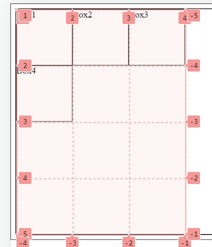
Grid lines
grid lines are vertical and horizontal lines running through the entire CSS grid, imagine a table
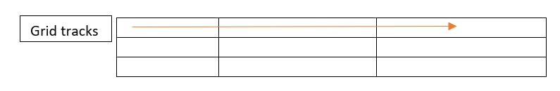
Grid tracks
Space between two consecutive lines is called grid tracks, it can either row or column
Grid cells
space between four consecutive lines is called grid cells, similar to the table every table cell is similar to a grid cell
Ways to create rows and columns
We can use these properties to create rows and columns
grid-template-rows: X X X X -> 'X' defines the number of rows in the grid container
grid-template-column: Y Y Y Y ->' Y' defines the number of columns in the container
Example:
repeat()
A shorthand way to define rows or column size and no. of items can be achieved using the repeat(x,y) method -> first parameter(x) is for how much time items should repeat and the second parameter(y) is for the size of a cell
Example:
Positioning grid items
Individual items can be placed in different positions
grid-column-start and grid-column-end are the start and end positions of the item
grid-row-start and grid-row-end are positioned in horizontally for an item
Example:


